Why does the chromaticity diagram look like that?
I’ve always wanted to understand color theory, so I started reading about the XYZ color space which looked like it was the mother of all color spaces. I had no idea what that meant, but it was created in 1931 so studying 93-year old research seemed like a good place to start.
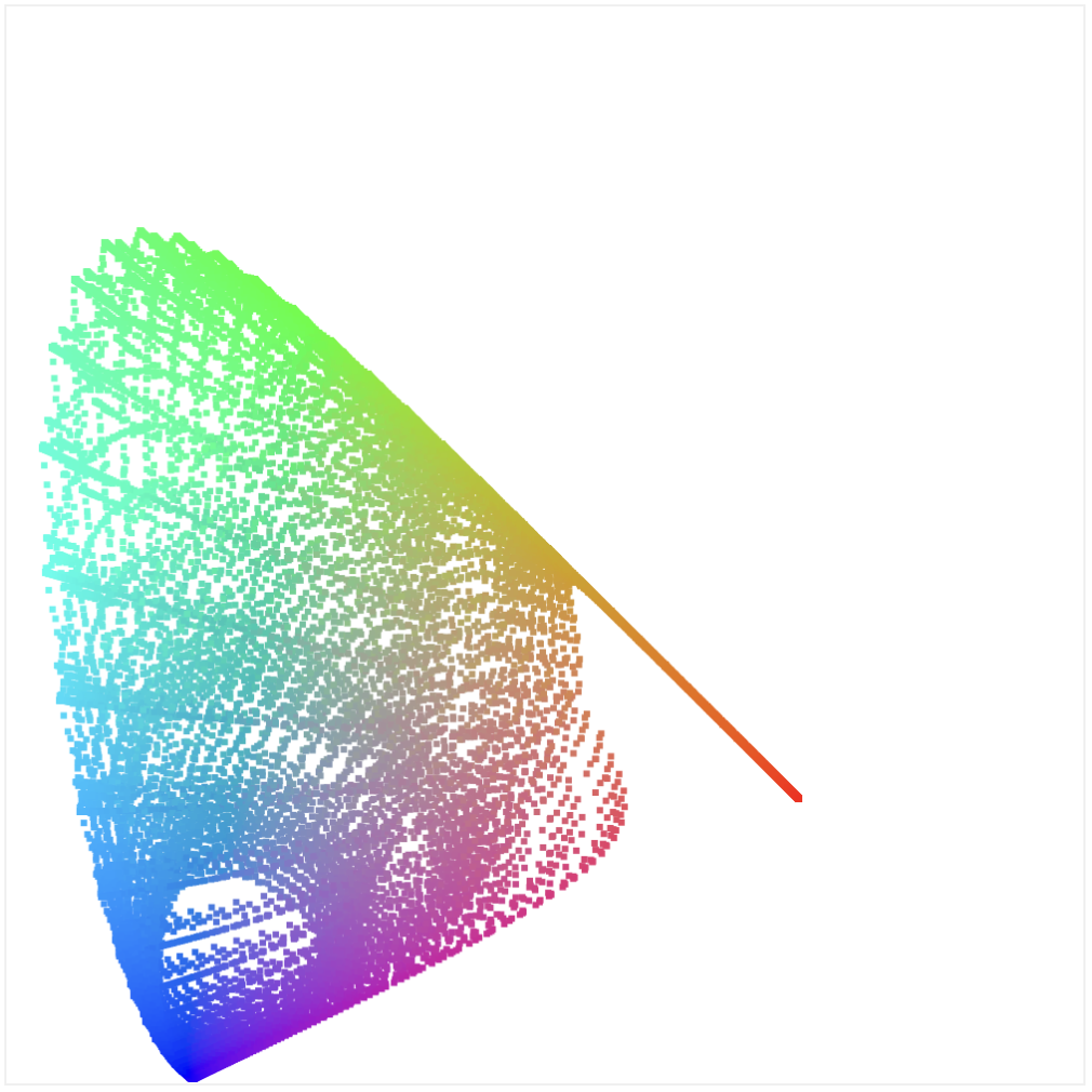
When reading about the XYZ color space, this cursed image keeps popping up:

I say “cursed” because I have no idea what that means. What the heck is that shape??
I couldn’t find any reasonably clear answer to my question. It’s obviously not a formula like x = func(y). Why is it that shape, and where did the colors come from? Obviously the edges are wavelengths which have a specific color, but how did the image above compute every pixel?
I became obsessed with this question. Below is the path I took to try to answer it.
I’ll spoil the answer but it might not make sense until you read this article: the shape comes from how our eyes perceive red, green, and blue relative to each other. Skip to the last section if you want to see some direct examples.
The fill colors inside the shape are another story, but a simple explanation is there is some math to calculate the mixture of colors and we can draw the above by sampling millions of points in the space and rendering them onto the 2d image.
Let’s dig in more.
Color matching functions
The first place to start is color matching functions. These functions determine the strength of specific wavelengths (color) to contribute so that our eyes perceive a target wavelength (color). We have 3 color matching functions for red, green, and blue (at wavelengths 700, 546, and 435 respectively), and these functions specify how to mix RGB to so that we visually see a spectral color.
More simply put: imagine that you have red, green, and blue light sources. What is the intensity of each one so that the resulting light matches a specific color on the spectrum?
Note that these are spectral colors: monochromatic light with a single wavelength. Think of colors on the rainbow. Many colors are not spectral, and are a mix of many spectral colors.
The CIE 1931 color space defines these RGB color matching functions. The red, green, and blue lines represent the intensity of each RGB light source:
Note: this plot uses the table from the original study. This raw data must not be used anymore because I couldn’t find it anywhere. I had to extract it myself from an appendix in the original report.
Given a wavelength on the X axis, you can see how to “mix” the RGB wavelengths to produce the target color.
How did they come up with these? They scientifically studied how our eyes mix RGB colors by sitting people down in a room with multiple light sources. One light source was the target color, and the other side had red, green, and blue light sources. People had to adjust the strength of the RGB sources until it matched the target color. They literally had people manually adjust lights and recorded the values! There’s a great article that explains the experiments in more detail.
There’s a big problem with the above functions. Can you see it? What do you think a negative red light source means?
It’s nonsense! That means with this model, given pure RGB lights, there are certain spectral colors that are impossible to recreate. However, this data is still incredibly useful and we can transform it into something meaningful.
Introducing the XYZ color matching functions. The XYZ color space is simply the RGB color space, but multiplied with a matrix to transform it a bit. The important part is this is a linear transform: it’s literally the same thing, just reshaped a little.
I found a raw table for the XYZ color matching functions here and this is what it looks like. The CIE 1931 XYZ color matching functions:
Wikipedia defines the RGB matrix transform as this:
matrix = [
  2.364613,  -0.89654, -0.468073,
 -0.515166,  1.426408, 0.088758,
  0.005203, -0.014408, 1.009204
]

[R, G, B] = matrix * [X, Y, Z]
We can take the XYZ table and transform it with the above matrix, and doing so produces this graph. Look familiar? This is exactly what the RGB graph above looks like (plotted directly from the data table)!
Wikipedia also documents an analytical approximation of this data, which means we can use mathematical functions to generate the data instead of using tables. Press “view source” to see the algorithm:
How is this useful?
Ok, so we have these color matching functions. When displaying these colors with RGB lights though, we can’t even show all of the spectral colors. Transforming it into XYZ space, where everything is positive, fixes the numbers but what’s the point if we still can’t physically show them?
The XYZ space describes all colors, even colors that are impossible to display. It’s become a standard space to encode colors in a device-independent way, and it’s up to a specific device to interpret them into a space that it can physically produce. This is nice because we have a standard way to encode color information without restricting the possibilities of the future – as devices become better at displaying more and more colors, they can automatically start displaying them without requiring any infrastructure changes.
Chromaticity
Now let’s get back to that cursed shape. That’s actually a chromaticity diagram, which is “objective specification of the quality of a color regardless of its luminance”.
We can derive the chromaticity for a color by taking the XYZ values for it dividing each by the total:
const x = X / (X + Y + Z)
const y = Y / (X + Y + Z)
const z = Z / (X + Y + Z) = 1 - x - y
We don’t actually need z because we can derive it given x and y. Hence we have the “xy chromaticity diagram”. Remember how I said it’s a 3d curve projected onto a 2d space? We’ve done that by just dropping z.
If we want to go back to XYZ from xy, we need the Y value. This is called the xyY color space and is another way to encode colors.
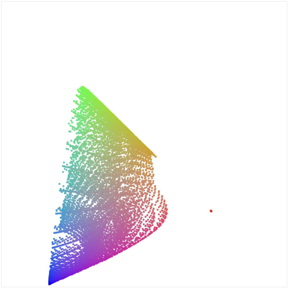
Alright, let’s try this out. Let’s take the RGB table we rendered above, and plot the chromaticity. We do this by using the above functions, and plotting the x and y points (the colors are a basic estimation):
Hey! Look at that! That looks familiar. Why is it so slanted though? If you look at the x axis, it actually goes into negative! That’s because the RGB data is representing impossible colors.
Let’s use an RGB to XYZ matrix to transform it into XYZ space (the opposite of what we did before, where we transformed XYZ into RGB) space. If we render the same data but transformed, it looks like this:
Now that’s looking really familiar!
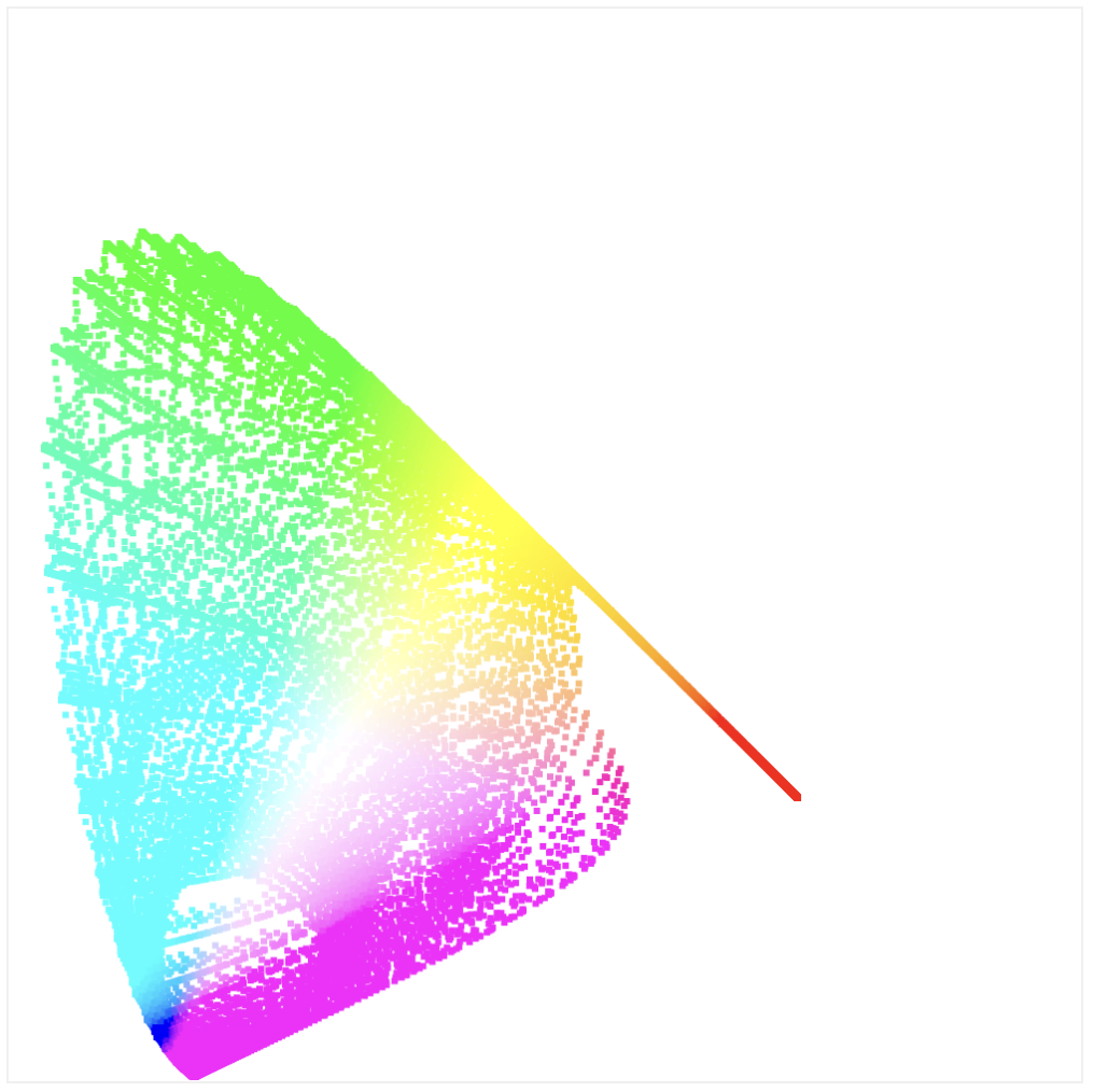
Just to double-check, let’s render the chromaticity of the XYZ table data. Note that we have more granular data here, so there are more points, but it matches:
Ok, so what about colors? How do we fill the middle part with all the colors? Note: this is where I really start to get out my league, but here’s my best attempt.
What if we iterate over every single pixel in the canvas and try to plot a color for it? The question is given x and y, how do we get a color?
Here are some steps:
- We scale each x and y point in the canvas to a value between 0 and 1
- Remember above I said we need the
Yvalue to transform back into XYZ space? Turns out that the XYZ space intentionally madeYmap to the luminance value of a color, so that means we can… make it up? - What if we just try to use a luminance value of 1?
- That lets us generate XYZ values, which we then translate into sRGB space (don’t worry about the
sthere, it’s just RGB space with some gamma correction)
One immediate problem you hit this produces many invalid colors. We also want to experiment with different values of Y. The demo below has controls to customize its behavior: change Y from 0 to 1, and hide colors with elements below 0 or 255.
That’s neat! We’re getting somewhere, and are obviously constrained by the RGB space. By default, it clips colors with negative values and that produces this triangle. Feels like the dots are starting to connect: the above image is clearly showing connections between XYZ/RGB and limitations of representable colors.
Even more interesting is if you turn on “clip colors max”. You only see a small slice of color, and you need to move the Y slider morph the shape to “fill” the triangle. Almost like we’re moving through 3d space.
For each point, there must be a different Y value that is the most optimal representation of that color. For example, blues are rich when Y is low, but greens are only rich when Y is higher.
Taking a break: spectrums
I’m still confused how to fill that space within the chromaticity diagram, so let’s take a break.
Let’s create a spectrum. Take the original color matching function. Since that is telling us the XYZ values needed to create a spectral color, shouldn’t we be able to iterate over the wavelengths of visible colors (400-720), get the XYZ values for each one, and convert them to RGB and render a spectrum?
This looks pretty bad, but why? I found a nice article about rendering spectra which seems like another deep hole. My problems aren’t even close to that kind of accuracy; the above isn’t remotely close.
Turn out I need to convert XYZ to sRGB because that’s what the rgb() color function is assuming when rendering to canvas. The main difference is gamma correction which is another topic.
We’ve learned that sRGB can only render a subset of all colors, and turns out there are other color spaces we can use to tell browsers to render more colors. The p3 wide gamut color space is larger than sRGB, and many browsers and displays support it now, so let’s test it.
You specify this color space by using the color function in CSS, for example: color(display-p3 r, g, b). I ran into the same problems where the colors were all wrong, which was surprising because everything I read implied it was linear. Turns out the p3 color space in browsers has the same gamma correction as sRGB, so I needed to include that to get it to work:
If you are seeing this on a wide gamut compatible browser and display, you will see more intense colors. I love that this is a thing, and the idea that so many users are using apps that could be more richly displayed if they supported p3.
I started having an existential crisis around this point. What are my eyes actually seeing? How do displays… actually work? Looking at the wide gamut spectrum above, what happens if I take a screenshot of it in macOS and send it to a user using a display that doesn’t support p3?
To test this I started a zoom chat with a friend and shared my screen and showed them the wide gamut spectrum and asked if they could see a difference (the top and bottom should look different). Turns out they could! I have no idea if macOS, zoom, or something else is translating it into sRGB (thus “downgrading” the colors) or actually transmitting p3. (Also, PNG supports p3, but what do monitors that don’t support it do?)
The sheer complexity of abstractions between my eyes and pixels is overwhelming. There are so many layers which handle reading and writing the individual pixels on my screen, and making it all work across zoom chats, screenshots, and everything is making my mind melt.
Let’s move on.
A little question: why does printing use the CMY color system with the primaries of cyan, magenta, and yellow, while digital displays build pixels with the primaries of reg, green, and blue? If cyan, magenta, and yellow allow a wider range of colors via mixing why is RGB better digitally? Answer: because RGB is an additive color system and CMY is a subtractive color system. Materials absorb light, while digital displays emit light.
Back to the grind
We’re not giving up on figuring out the colors of the chromaticity diagram yet.
I found this incredible article about how to populate chromaticity diagrams. I still have no idea if this is how the original ones were generated. After all, the colors shown are just an approximation (your screen can’t actually display the true colors near the edges), so maybe there’s some other kind of formula.
So that I can get back to my daily life and be present with my family, I’m accepting that this is how those images are generated. Let’s try do it ourselves.
There’s no way to go from an x, y point in the canvas to a color. There’s no formula tells us if it’s a valid point in space or how to approximate a color for it.
We need to do the opposite: start with an value in the XYZ color space, compute an approximate color, and plot it at the right point by converting it into xy space. But how do we even find valid XYZ values? Not all points are valid inside that space (between 0 and 1 on all three axes). To do that we have to take another step back.
I got this technique from the incredible article linked above. What we’re trying to is render all colors in existence. Obviously we can’t actually do that, so we need an approximation. Here’s the approach we’ll take:
- First, we need to generate an arbitrary color. The only way to do this is to generate a spectral line shape. Basically it’s a line across all wavelengths (the X axis) that defines how much each wavelength contributes to the color.
- To get the xy, coordinate on the canvas, we need to get the XYZ values for the color. To do that, we multiply the XYZ color matching functions with the spectral line, and then take the integral of each line to get the final XYZ values.
- We do the same for the RGB color. We multiply the RGB color matching functions with the spectral line and take the integral of each one for the final RGB color. (We’ll talk about the colors more later)
I don’t know if that made any sense, but here’s a demo which might help. The graph in the bottom left is the spectral line we are generating. This represents a specific color, which is shown in the top left. Finally, on the right we plot the color on the chromaticity diagram by summing up the area of the spectral line multiplied by the XYZ color matching functions.
We generated the spectral line graph with two simple sine curves with a specific width and offset. You can change the offset of each curve with the sliders below. You can see that moving those curves, which generates a different spectral line (and thus color) which plots different points on the diagram.
By adjusting the sliders, you are basically painting the chromaticity diagram!
You can see how all of this works but pressing “view source” to see the code.
Obviously this is a very poor representation of the chromaticity diagram. It’s difficult to cover the whole area; adjusting the offset of the curves only allows you to walk through a subset of the entire space. We would need to change how we are generating spectral lines to fully walk through the space.
Here’s a demo which attempts to automate this. It’s using the same code as above, except it’s changing both offset and width of the curves and walking through the space better:
I created an isolated codepen if you want to play with this yourself. If you let this run for a while, you’ll end up with a shape like this:
We’re still not walking through the full space, but it’s not bad! It at least… vaguely resembles the original diagram?
What’s going on with the colors?
Our coloring isn’t quite right. It’s missing the white spot in the middle and it’s too dark in certain places. Let me explain a little more how we generated these colors.
After all, didn’t we generate RGB colors? If so, why weren’t they clipped and showing a triangle like before? Or at least we should see more “maxing out” of colors near the edges.
My first attempts at the above did show this. Here’s a picture where I only took the integral to find the XYZ values, and then took those values and used XYZ_to_sRGB to transform them into RGB colors:
We do get more of the bright white spot in the middle, but the colors are far too saturated. It’s clear that many of these colors are actually invalid (they are not in between 0 and 255).
Another technique I learned from the incredible article is to avoid using the XYZ points to find the color, and instead do the same integration over the RGB color mapping functions. So we take our spectral line, multiple by each of the RGB functions, and then take the sum of each result to find the individual RGB values.
Even though this still produces invalid colors, intuitively I can see how it more directly maps onto the RGB space and provides a better interpolation.
That’s about as far as I got. I wish I had a better answer for how to generate the colors here, and maybe you know? If so, give me a shout! I’m satisfied with how far I got, and I bet the final answer uses slightly different color matching functions or something, but it doesn’t feel far off.
If you have ideas to improve this, please do so in this demo! I’d love to see any improvements.
I want to drive home that my above implementation is still generating invalid colors. For example, if I add clipping and avoid rendering any colors with elements outside of the 0-255 range, I get the familiar sRGB triangle:
It turns out that even though colors outside the triangle aren’t rendering accurately, we’re still able to represent a change of color because only 1 or 2 of the RGB channels have maxed out. If green maxes out, changes in the red and blue channels will still show up.
More shape explorations
But really, why that specific shape? I know it derives from how we perceive red, green, and blue relative to each other. Let’s look at the XYZ color matching functions again:
The shape is derived from these shapes. To render chromaticity, you walk through each wavelength above and calculate the percentage of each XYZ value of the total. So there’s a direct relationship.
Let’s drive this home by generating our own random color matching functions. We generate them with some simple sine waves (view source to see the code):
Now let’s render the chromaticity according to our nonsensical color matching functions:
The shape is very different! So that’s it: the shape is due to the XYZ color matching functions, which were derived from experiments that studied how our eyes perceive red, green, and blue light. That’s why the chromaticity diagram represents something meaningful: it’s how our eyes perceive color.
Resources: